How to Write Brand Guidelines: A Step-by-Step Guide With Examples
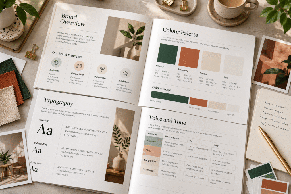
Plenty of brand guidelines look impressive and still fail. The cover is elegant, the logo pages are polished, and then someone asks how the brand should sound in an email apology, or whether a headline should be in sentence case, and the document has nothing to say.
The problem is usually the writing. Brand guidelines are a working document, and the way the rules are written decides whether people can follow them. This guide covers how to write brand guidelines that are clear, specific, and usable, with example wording you can adapt.
If you’re more interested in the visual layout of the document, see our companion piece, [How to Design Brand Guidelines: A Practical Guide].
What Writing Brand Guidelines Actually Involves
Writing brand guidelines means turning brand decisions into instructions someone else can follow without asking you.
That involves three jobs:
- Explaining the brand so people understand the reasoning behind the rules
- Writing the rules clearly enough to apply without guessing
- Writing in the brand’s own voice, so the document itself feels like the brand
A guideline that says “use our colours tastefully” explains nothing. One that says “use the primary blue for headers and buttons, and the orange only for calls to action” can be followed by anyone.
Before You Write: Gather Your Inputs
You can only write down decisions that exist. Before drafting, collect:
- Brand strategy: positioning, audience, values, personality, and what makes the brand different. If these aren’t defined, start with brand strategy first; guidelines built on vague positioning come out vague.
- Identity assets: final logo files, colour values, typefaces, imagery, icons, and graphic elements.
- Real examples: current website pages, social posts, decks, packaging, and email, both good and inconsistent.
- Common questions: the things your team and vendors already ask. These tell you what the document must answer.
- Audience for the guidelines: designers, marketers, sales, developers, agencies, or all of them.
Our post on [Brand Strategy vs Brand Identity: What’s the Difference?] explains how these inputs relate if you need a refresher.
Step 1: Decide the Structure
Organise the document around how people will look things up, not around how the brand was built. A practical order:
- Brand overview
- Logo
- Colour
- Typography
- Imagery and graphic elements
- Voice and tone
- Applications and templates
- Digital use
- Do’s and don’ts
- Ownership and contacts
For smaller businesses, a shorter version works fine: logo, colour, typography, and voice. You can add sections as the brand grows.
Step 2: Write the Brand Overview Briefly
This section gives context for every rule that follows. Keep it short and concrete. Cover:
- What the brand does and for whom
- Its positioning in one or two sentences
- Three to five values or personality traits, each with a line of explanation
- What the brand wants to be known for
Example wording:
We help independent restaurants run smoother kitchens. We’re practical, friendly, and direct. We explain things simply, we respect our customers’ time, and we’d rather show than boast.
Avoid generic statements like “we are passionate about excellence.” Any company could say that. Specific beliefs and behaviours are more useful.
Step 3: Write Rules That Can Be Followed
This is the core skill. A usable rule is specific, measurable where possible, and explains why.
Weak: “Give the logo enough space.” Better: “Keep clear space around the logo equal to the height of the letter ‘A’ in the wordmark. This keeps it legible against busy backgrounds.”
Weak: “Use brand colours consistently.” Better: “Use Deep Blue (#1F3A5F) for headings and primary buttons. Use Amber (#F2A33A) only for calls to action, so they stand out.”
Useful habits when writing rules:
- Use precise values, sizes, and names rather than descriptions.
- Give the reason behind the rule in one sentence.
- Say what to do, and show one wrong example of what not to do.
- Use consistent names for things. If a colour is “Deep Blue” in one place, don’t call it “Navy” in another.
Step 4: Write the Logo Section
State exactly which logo versions exist, when to use each, and what to avoid. Cover:
- Primary logo and variations
- Clear space and minimum size
- Approved versions for light, dark, and photo backgrounds
- Misuse examples, such as stretching, recolouring, adding effects, or placing on cluttered images
Example wording:
Use the horizontal logo wherever there’s room. Use the stacked version in square spaces. Use the icon alone only where the full name appears nearby, such as a social media avatar. Never stretch, rotate, or recolour the logo.
If you don’t yet have a final mark, a clear logo design comes before this section, since guidelines should document a finished logo.
Step 5: Write the Colour and Typography Sections
Colours need values in every format the brand uses (HEX and RGB for screens, CMYK for print, Pantone where relevant) plus guidance on how they work together.
Describe each colour by role:
- Primary: the colours that carry the brand
- Secondary: supporting colours for variety
- Neutral: text, backgrounds, and borders
- Functional: success, warning, and error states for digital products
Also record which text and background pairings have enough contrast to be readable. The W3C Web Content Accessibility Guidelines set the minimum contrast standards, and guidelines are a good place to apply them.
For typography, write down:
- Typeface names and where each is used
- A simple hierarchy: headline, subheading, body, caption
- Sizes, weights, and line spacing
- Fallback fonts for email or documents where brand fonts aren’t available
- Licensing notes, such as whether fonts are cleared for web or app use
Example wording:
Headlines use Source Serif in semibold. Body text uses Inter in regular at 16px with 1.5 line spacing. In email, use Georgia and Arial as fallbacks.
Step 6: Write the Imagery and Graphic Sections
Visual style is hard to describe in words, so pair short descriptions with examples. Cover:
- Subject matter and composition
- Lighting and colour treatment
- What to avoid
- Icon style, patterns, and recurring shapes
Example wording:
Photography is natural and unposed, shot in daylight with real kitchens and real staff. Avoid staged handshakes, overly glossy stock imagery, and heavy filters.
Consistent graphic design assets make these rules easier to follow, so include a library of approved patterns, icons, and templates alongside the written guidance.
Step 7: Write the Voice and Tone Section
This is where most guidelines are weakest, and where writing skill matters most. Voice is how the brand always sounds. Tone is how that voice adjusts to the situation.
A reliable format for each voice trait:
- The trait: clear, warm, confident
- What it means: how it shows up in writing
- What it doesn’t mean: the boundary, so it isn’t overdone
Example wording:
Clear. We use plain words and short sentences. We explain technical terms the first time we use them. Clear doesn’t mean oversimplified. We respect our readers’ intelligence.
Then add a tone guide for different situations:
| Situation | Tone | Example |
|---|---|---|
| Product launch | Excited, concrete | “The new scheduling tool is live. Here’s what it does.” |
| Support reply | Calm, helpful | “Thanks for flagging this. Here’s how we’ll fix it.” |
| Error message | Clear, blame-free | “That didn’t go through. Please check your details and try again.” |
| Apology | Honest, brief | “We got this wrong, and we’re sorry. Here’s what we’re doing about it.” |
Add practical writing rules, too: sentence case or title case for headlines, how to write numbers and dates, which words to prefer or avoid, and how to write calls to action. A documented voice also gives your content strategy a firm starting point.
Step 8: Write the Applications and Digital Sections
Show the brand in the places it actually appears, and write rules for each: business cards, presentations, social posts, email signatures, packaging, signage, and the website.
For digital use, document things developers and designers need:
- Button, form, and navigation styles
- Spacing and layout principles
- Responsive behaviour on mobile, tablet, and desktop
- Social profile and post formats
- Interaction and motion principles
Teams building a site from the guidelines need this level of detail, whether the work is UI/UX design or implementation through web design and development. For physical products, add packaging design rules, since packaging tests colour and typography decisions in the real world.
Step 9: Add Do’s, Don’ts, and Ownership
A quick-reference page of correct and incorrect examples gets used more than almost any other section. Keep it visual and short.
Finish with practical details:
- Who owns the brand and approves exceptions
- Where the latest logo files, fonts, and templates are stored
- How to request help or approval
- When the guidelines were last updated
Without this, even well-written guidelines go out of date.
Step 10: Edit for Clarity and Test
Once drafted, edit the document the way you would any important piece of writing:
- Cut anything that doesn’t change how someone would act.
- Replace vague words (tasteful, modern, premium) with specific descriptions.
- Check that terms and names are consistent throughout.
- Make sure the document follows its own voice rules.
- Ask someone who wasn’t involved, such as a new hire or freelancer, to produce a simple piece using only the guidelines. Where they get stuck shows what’s missing.
Common Mistakes When Writing Brand Guidelines
- Vague language. “Use a clean, modern look” tells nobody what to do.
- Rules without reasons. People follow rules more reliably when they understand why.
- No examples. Abstract guidance is easy to misread.
- Writing for the creator, not the reader. Use plain language, not internal jargon.
- Skipping voice. Visual consistency alone leaves the brand sounding different in every channel.
- Inconsistent terminology. Changing names for the same thing creates confusion.
- Too long. If people can’t find answers quickly, they stop opening it.
- No owner or update plan. Guidelines go stale without someone responsible.
- Written once and forgotten. Review them when the business, channels, or identity change.
Quick Writing Checklist
- Every rule is specific and has a reason
- Names, values, and sizes are exact
- Each section includes at least one example
- Voice traits include “what it doesn’t mean”
- Do’s and don’ts are visual and short
- Digital use is covered
- Accessibility is considered
- Ownership and update dates are listed
- The document follows its own voice
- Someone outside the project has tested it
Need Help Writing and Building Your Guidelines?
Brand guidelines are easiest to write when the strategy and identity behind them are already solid. Akkenna works across strategy, design, technology, and growth, so the thinking, the visual system, and the digital application can be developed together. If your brand looks or sounds different depending on who made the work, talk to Akkenna about a brand review.
FAQ
How do you write brand guidelines? Gather your brand strategy and identity assets, structure the document around how people will look things up, then write specific, example-backed rules for logo, colour, typography, imagery, voice, and applications. Test it with someone outside the project before sharing it.
What should brand guidelines include? Most include a brand overview, logo rules, colours, typography, imagery, voice and tone, applications, digital guidance, do’s and don’ts, and contact or ownership details. The scope depends on the size of the business.
How long should brand guidelines be? There’s no fixed length. A small business may need a few pages, and a larger brand with many channels needs more. The right length is the one people will actually read and use.
How do you write a brand voice section? Define three to five voice traits, explain what each means and what it doesn’t, add a tone guide for different situations, and include sample headlines, calls to action, and messages.
Who should write brand guidelines? Ideally someone who understands both the brand strategy and how the identity works in practice, often a brand strategist or designer working with the marketing lead. Smaller teams can write them in-house and have them reviewed.
What’s the difference between writing and designing brand guidelines? Writing covers the content: the explanations, rules, voice guidance, and examples. Designing covers how that content is laid out and presented. Both matter, and the best guidelines are clear in content and easy to navigate.
How often should brand guidelines be updated? Review them whenever the business, audience, channels, or identity change, and check periodically even when nothing major has changed.
Do small businesses need brand guidelines? A short set covering logo, colours, fonts, and voice can prevent inconsistency early, and it can grow with the business.
