Fitness Logo Design: How to Create a Logo That Builds Trust and Motivation
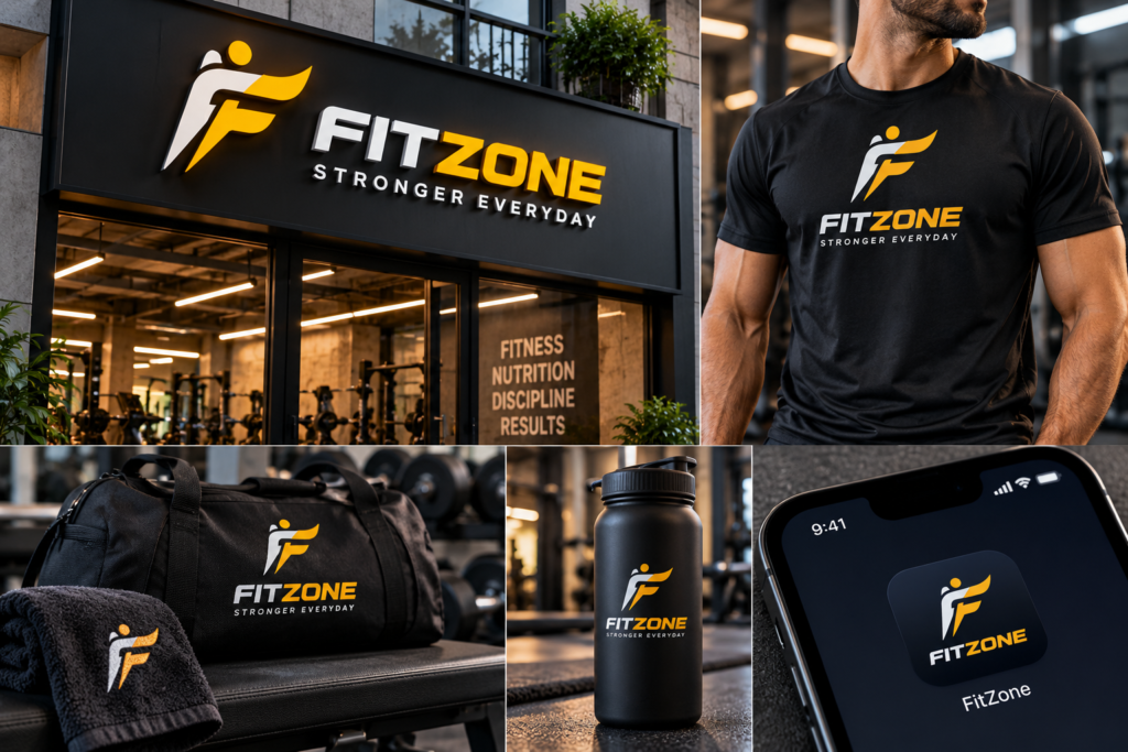
Walk down any street with a few gyms, yoga studios, and personal training brands, and you’ll notice something: many of their logos look alike. Dumbbells, flexing arms, flames, and bold italic type appear again and again. They signal “fitness” quickly, but they don’t signal anything specific about the business behind them.
Good fitness logo design does more than show that you’re in the fitness industry. It tells people who your brand is for, what training with you feels like, and why they should trust you with their health and effort. This guide explains how to design a fitness logo that stands out, from understanding your positioning to choosing a style, colours, and typography, and applying the logo across signage, uniforms, social media, and apps.
What Is a Fitness Logo, and What Should It Do?
A fitness logo is the visual mark that identifies a gym, studio, trainer, class, app, or fitness product. It sits on your signage, website, social media, uniforms, equipment, membership cards, and merchandise, so it needs to do several jobs:
- Be recognisable at a glance, including at small sizes
- Communicate your positioning: premium, community-led, beginner-friendly, performance-focused, wellness-led
- Build trust, because fitness is personal and members are committing their time and body
- Differentiate you from other local and online options
- Work across formats, from a gym wall to a phone screen
- Support the broader brand, including colours, typography, imagery, and voice
A logo is one part of a brand identity, not the whole of it. We explain the difference in [Brand Strategy vs Brand Identity: What’s the Difference?]
Why Fitness Logo Design Needs Extra Thought
Fitness brands have a few specific challenges:
- The category is crowded. Gyms, trainers, studios, apps, and supplement brands all compete for attention.
- Clichés are everywhere. Dumbbells, biceps, and flames are easy to draw and easy to confuse.
- Audiences vary widely. A women-only wellness studio, a strength gym, and a kids’ fitness academy should not look alike.
- The logo appears in demanding places. Embroidered on uniforms, printed on bottles, engraved on equipment, and shrunk into app icons.
- Emotion matters. People respond to motivation, belonging, energy, calm, or confidence, depending on the brand.
Step 1: Start With Positioning, Not Symbols
Before sketching anything, answer a few strategic questions. This is the thinking behind a brand strategy, and it prevents the logo from becoming a generic fitness icon.
- Who is the target member? Beginners, athletes, busy professionals, seniors, women, teens, families, or competitive lifters?
- What type of fitness business is it? Gym, boutique studio, personal training, yoga or Pilates, martial arts, CrossFit-style training, online coaching, fitness app, or product brand?
- What is the personality? Energetic, supportive, premium, rugged, calm, playful, or disciplined?
- What makes you different? Coaching style, community, results approach, facilities, price, location, or philosophy?
- How should members feel? Motivated, welcomed, challenged, relaxed, or confident?
A powerlifting gym and a beginner-friendly wellness studio need very different visual signals, even though both are “fitness.”
Step 2: Choose a Logo Type
There are several common logo types. Each suits different kinds of fitness brands.
Wordmark
The brand name set in distinctive typography. Works well when your name is short, memorable, and you want the type to carry the personality. It’s clean, flexible, and easy to apply.
Lettermark or monogram
Initials in a designed form. Useful for longer names, premium positioning, and small applications like app icons and uniforms.
Symbol or icon plus wordmark
A graphic mark paired with the name. Gives you a standalone icon you can use on social avatars and equipment, with the name for fuller contexts.
Emblem or badge
Text enclosed in a shape, such as a shield or circle. Suits gyms that want a strong, traditional, community or team feeling. Emblems can be detailed, so check they remain legible at small sizes.
Mascot
A character that represents the brand, often used in kids’ fitness, martial arts, or playful community brands. It adds personality but needs careful design to keep it professional and versatile.
Abstract mark
A non-literal shape that conveys movement, energy, or balance. It’s distinctive, but needs consistent use to build meaning.
Choose based on your audience and where the logo will appear most, not just on what looks appealing.
Step 3: Explore Symbols and Concepts (Beyond the Clichés)
Symbols can help express what you do, but the most obvious ones are overused. Think about a concept from your brand story instead of reaching for the default. Possible directions include:
- Movement and flow: curves or lines that suggest motion, suited to yoga, dance, and mobility studios
- Strength and structure: solid geometry, angular forms, or architectural shapes for strength and performance gyms
- Growth and progress: upward forms, steps, or rising shapes for transformation-focused programmes
- Balance and breath: circles and symmetry for wellness and mindfulness brands
- Community and unity: interlocking or shared forms for group classes and team-based training
- Local identity: references to a neighbourhood, landmark, or culture that members relate to
- Letterforms: using the initial or name in a clever, ownable way
If you do use familiar fitness imagery such as a kettlebell or a figure, give it a fresh, simplified treatment so it feels like yours.
Step 4: Choose Colours With Purpose
Colour sets mood quickly. Responses to colour vary by culture and context, so treat common associations as starting points rather than rules.
- Red and orange: often linked with energy, intensity, and action
- Black and charcoal: often suggest strength, seriousness, and premium positioning
- Blue: often associated with trust, calm, and reliability
- Green: often linked with health, nature, and balance
- Yellow: can signal optimism and high energy, though it needs care for readability
- Pastels and earth tones: common in yoga, wellness, and holistic studios, suggesting softness and calm
- Neon accents: can feel youthful and high-energy, but may date quickly
Practical considerations matter as much as meaning:
- Limit the palette to a few colours.
- Check that the logo works in one colour, black, and white, since it will be embroidered, engraved, and printed in different ways.
- Test contrast on light and dark backgrounds.
- Check that colours look right on screens, in print, and on fabric.
Step 5: Select Typography That Matches the Personality
Typography often carries more of the personality than the symbol.
- Bold sans-serif: strong, direct, and modern, common in strength and performance brands
- Condensed or tall type: athletic and energetic, but make sure spacing stays readable
- Rounded sans-serif: friendly and approachable, useful for beginner-friendly or family-oriented studios
- Light, refined type: calm and premium, suited to boutique wellness and yoga brands
- Custom lettering: can make a wordmark unique, particularly for names that matter to the brand’s story
Avoid overly decorative or thin fonts that disappear at small sizes or on embroidery. Make sure the name reads clearly from a distance, such as on a building sign or a gym wall.
Step 6: Design for Real-World Use
Fitness logos get used in more demanding ways than many other categories. Test the design in:
- Signage: exterior boards, reception walls, and gym floor graphics, where legibility from a distance matters
- Uniforms and apparel: embroidery and screen printing need simple shapes and limited colours
- Equipment and merchandise: engraving, stamping, bottles, towels, and bags
- Membership cards, forms, and printed material
- Social media profile images, which are small and often circular
- Mobile apps and app icons, which require a simplified, square-friendly version
- Websites and online booking, where the logo sits in headers and favicons
- Packaging, for supplement, nutrition, or equipment brands. Good packaging design extends the logo onto labels and boxes
Most fitness brands benefit from a small logo set: a primary logo, a horizontal and stacked version, an icon or monogram for small spaces, and one-colour variants. Designing the full set from the start prevents awkward workarounds later. This is a normal part of professional logo design.
Step 7: Build the Identity Around the Logo
A strong logo works best inside a system. Once the logo is chosen, define:
- Colour palette and how each colour is used
- Typography for headlines, body, and interface
- Imagery style: real members, training in action, studio environments, or lifestyle photography
- Graphic elements: patterns, shapes, icons, and layout styles that support the brand
- Tone of voice: motivating, friendly, no-nonsense, or calm
- Templates for class schedules, offers, and announcements
Consistent graphic design across posters, social posts, and promotions makes the brand look cohesive. Writing the rules into brand guidelines helps trainers, front-desk staff, and freelancers apply the identity correctly. See [How to Design Brand Guidelines: A Practical Guide] for how to put them together, and [How to Create a Visual Brand Identity: A Step-by-Step Guide] for the wider identity process.
Step 8: Extend the Logo Into Digital and Motion
Many fitness brands depend on digital channels for membership, bookings, and community.
- Website: the logo and identity should carry through clear class schedules, pricing, trainer profiles, and sign-up flows. Well-planned web design and development keeps this consistent.
- Apps and booking tools: if you offer an app or online platform, the interface should reflect the brand. Considered UI/UX design makes booking and tracking simple.
- Social media: consistent templates, highlights, and video styles help you stay recognisable. Ongoing social media marketing turns the identity into everyday content.
- Video and motion: an animated logo for intros, class videos, and social content adds energy, and motion graphics can bring your brand to life in short clips and promos.
Fitness Logo Design Ideas by Type of Brand
Gyms and strength training
Bold type, strong geometry, and solid shapes communicate power and discipline. Keep it simple enough to embroider and engrave.
Yoga, Pilates, and wellness studios
Soft curves, balanced layouts, lighter typography, and calm colours suit mindfulness and flexibility. Avoid heavy, aggressive styling.
Personal trainers and coaches
Often built around a personal name. A clean wordmark or monogram with a clear personality can build a personal brand that grows with you.
Martial arts and combat sports
Emblems, badges, or symbols with cultural or traditional elements can suit these brands, but use them respectfully and accurately.
Kids’ and family fitness
Friendly shapes, brighter colours, and playful characters can work, as long as the brand still looks safe and professional to parents.
Fitness apps and online coaching
Simple, scalable marks that work as app icons and in small interface spaces. Think about dark mode and light mode.
Supplements, nutrition, and fitness products
Logos that work on labels, tubs, and packaging, with clear contrast and strong shelf presence.
Common Fitness Logo Design Mistakes
- Relying on clichés. Generic dumbbells and flexed arms make you look like everyone else.
- Too much detail. Complex logos fail at small sizes and on embroidery.
- Following trends only. Styles date quickly. Choose designs tied to your positioning.
- Poor legibility. Thin or heavily stylised type can be hard to read from a distance.
- Too many colours. It complicates printing, embroidery, and consistency.
- No one-colour version. You’ll need it for stamps, engraving, and some apparel.
- Ignoring the audience. A logo that appeals to the owner but not members misses the point.
- Copying competitors. Similarity creates confusion and weakens your brand.
- Skipping file formats. Without proper vector files, you’ll struggle with signage and printing.
- Not testing it in context. Always see the logo on a sign, a shirt, a phone screen, and a bottle before approving.
What Files Should You Receive?
A professional logo package usually includes:
- Vector files (such as SVG, AI, EPS, or PDF) that can scale to any size
- PNG files with transparent backgrounds for digital use
- Colour versions: full colour, one colour, black, and white
- Horizontal, stacked, and icon versions
- A favicon and social profile versions
- Basic usage guidance, or full brand guidelines
Agree on what’s included, who owns the final files, and how many concepts and revision rounds are part of the process before you start.
A Fitness Logo Design Checklist
- Positioning and audience defined
- Logo type chosen to fit the brand
- Concept avoids clichés and feels ownable
- Colours chosen with purpose and tested in one colour
- Typography clear, legible, and on-brand
- Works small (app icon, social avatar) and large (signage)
- Tested on uniforms, equipment, packaging, and screens
- Logo set includes variations
- Identity system and guidelines documented
- Files delivered in the right formats
Final Thought
The best fitness logos aren’t the loudest ones. They’re the ones that express a clear point of view, stay legible everywhere they appear, and make members feel they belong. Start with positioning, design for real-world use, and build a consistent identity around the mark.
If you’re launching or refreshing a fitness brand and would like help with logo design, identity, website, or social content, talk to Akkenna.
FAQ
What makes a good fitness logo? A good fitness logo is simple, memorable, and legible at any size, reflects the brand’s personality and audience, and works across signage, apparel, social media, and digital products.
What colours work best for a fitness logo? It depends on your positioning. Red and orange often suggest energy, black suggests strength, blue suggests trust, and green suggests health and balance. Choose colours that fit your brand and test them in one-colour use.
Should a fitness logo include a symbol like a dumbbell? Not necessarily. Familiar symbols are quick to understand but easy to confuse with competitors. A distinctive wordmark, monogram, or concept from your brand story often stands out more.
What types of logos suit gyms and fitness studios? Wordmarks, monograms, icon-plus-wordmark logos, emblems, mascots, and abstract marks can all work. The best choice depends on your audience, name, and where the logo will appear.
How do I design a logo for a yoga or wellness studio? Use softer shapes, balanced layouts, lighter typography, and calmer colours, and avoid aggressive styling. Focus on a feeling of balance, warmth, and trust.
Can I design my own fitness logo? You can, but professional design usually gives you a more distinctive, versatile, and properly prepared logo, including variations and correct file formats.
What file formats do I need for a fitness logo? Vector files for scalable use, transparent PNGs for digital, and colour, one-colour, black, and white versions, plus icon and favicon sizes.
Is a logo enough to build a fitness brand? No. A logo is one part of a brand. You also need clear positioning, consistent visuals, a good website, social presence, and a great member experience.
