From Brand Identity to Website: How a Brand Becomes a Digital Experience
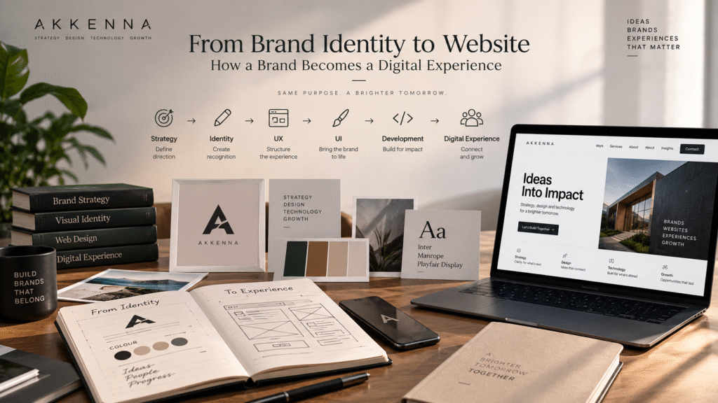
Introduction — A Brand Doesn’t Stop at the Logo
A company invests in a polished logo, a defined colour palette, carefully chosen typography, and a proper brand guidelines document. Then visitors land on the website, and something feels off. The layout looks generic. The messaging doesn’t sound like the brand described in the guidelines. Typography is applied inconsistently. Imagery feels stock rather than considered. CTAs look like they were copied from a template. On mobile, whatever personality the brand had on desktop mostly disappears.
None of this means the brand identity was poorly designed. It means the identity never fully made the move from brand identity to website — from a document to an actual, usable experience.
A brand identity becomes meaningful when people can experience it consistently, not simply when it exists in a guidelines PDF. And for most businesses, the website is the single most important place that experience happens.
What Is Brand Identity?
Worth separating three terms that get used loosely.
Brand strategy defines positioning, target audience, differentiation, value proposition, and overall direction — the thinking behind the brand.
Brand identity is how that thinking gets expressed: logo, colours, typography, imagery, graphic language, iconography, and brand voice.
Brand image is how customers actually perceive the brand, based on every interaction they’ve had with it.
The distinction matters because you can design a brand identity, but customers experience the brand through interactions and touchpoints — and the biggest, most detailed touchpoint most businesses have is their website.
What Does It Mean to Turn Brand Identity Into a Digital Experience?
The progression runs: Brand Strategy → Brand Identity → UX → UI → Content → Development → Digital Experience.
A website doesn’t simply “apply the logo.” It translates the brand into navigation, content hierarchy, visual hierarchy, page layouts, interactions, forms, CTAs, imagery, and mobile behaviour. This is where brand identity stops being static and becomes something people actually interact with.
The Brand Identity Elements That Influence a Website
Logo → recognition. The logo shows up in the header, footer, favicon, and mobile navigation — but it’s only one recognition cue among several. A brand that relies on the logo alone to be recognisable is missing the rest of its own system.
Colour → hierarchy and emotion. Brand colours guide buttons, links, backgrounds, highlights, and navigation — shaping what visitors notice first and what feels clickable. Brand colours still need to meet accessibility contrast requirements; a colour that looks right in a brand deck can fail usability on screen.
Typography → personality and readability. Headlines, body text, navigation labels, and mobile layouts all depend on type choices holding up in real digital interfaces, not just in print materials or brand presentations. A typeface that looks distinctive in a logo lockup can become illegible at small sizes on a phone.
Imagery → storytelling. Photography, illustration, product imagery, and video should reinforce positioning, not just fill empty space. Generic stock photography tends to undercut a carefully built identity faster than almost anything else on a page.
Iconography and graphic language → recognition. Icons, shapes, patterns, and recurring graphic elements build a visual language that’s recognisable even without the logo present.
Brand voice → website content. Voice should carry through headlines, body copy, CTAs, form labels, error messages, and microcopy. A website shouldn’t suddenly sound generic just because it’s a digital channel rather than a brochure.
Brand Strategy Comes Before Interface Design
The sequence is Audience → Positioning → Message → Experience.
An enterprise technology brand typically needs clarity, credibility, detailed information, case studies, and structured navigation — buyers are evaluating carefully and comparing vendors.
A premium consumer brand often leans on visual storytelling, emotional appeal, and editorial-quality imagery — the decision is more instinctive and experience-driven.
A startup usually needs a clear value proposition, fast comprehension, and simple navigation — visitors decide quickly whether the business is relevant to them.
The interface should serve the brand strategy, not the other way around. A website built around trendy interaction patterns rather than what the audience actually needs is solving the wrong problem.
From Brand Identity to UX: Where Strategy Becomes Structure
UX is the bridge between strategy and interface. It covers:
- Information architecture — how content and pages are organised
- Navigation — how users move through the site
- User journeys — how different audience segments reach their goals
- Content hierarchy — what visitors need to see first, second, and third
- Conversion paths — how visitors move toward meaningful actions like an enquiry, demo, booking, purchase, or download
These are strategic decisions before they’re visual ones. Getting the hierarchy wrong means even a beautifully designed page won’t guide people where the business needs them to go.
From UX to UI: Making the Brand Visible
UX is how the experience works. UI is how it looks and feels. UI covers layout, typography, colour, buttons, cards, forms, navigation styling, spacing, imagery, and motion — all built on top of the UX decisions already made.
Good UI expresses the brand while preserving usability. A visually striking interface that confuses visitors about what to do next has failed at UI’s actual job, regardless of how well it matches the brand guidelines.
Turning Brand Guidelines Into a Website Design System
Brand guidelines typically define colours, typography, spacing principles, imagery direction, icons, and graphic elements. A digital design system takes those and builds them into buttons, forms, cards, navigation, headings, content sections, modals, alerts, and responsive components that can be reused consistently.
This is what keeps a site consistent as it grows past its first handful of pages. It doesn’t need to be elaborate — a small business site needs a much lighter system than an enterprise platform with dozens of page types — but some documented consistency is worth having before a site expands.
How Website Content Becomes Part of the Brand
Branding isn’t only visual. Homepage messaging, service pages, product descriptions, the “About” page, case studies, blog content, CTAs, and microcopy all reinforce (or undermine) positioning, personality, expertise, and trust.
A beautifully designed website with generic messaging can still feel like a generic brand. Visual polish and distinctive positioning are separate jobs, and a site needs both to actually feel like the brand it represents.
How Interactions Become Part of the Brand
Hover states, scroll behaviour, page transitions, form interactions, loading states, error messages, and confirmation messages are all small moments where brand personality can come through — or quietly disappear.
Motion should support usability and brand expression, not exist simply because animation is possible. A confident, restrained brand rarely needs elaborate animation to prove it; often the opposite communicates the personality better.
Responsive Design: Keeping the Brand Consistent Across Devices
The identity needs to hold up across desktop, tablet, and mobile — responsive typography, logo placement, navigation patterns, image cropping, spacing, and content hierarchy all shift by screen size. The goal is that the brand stays recognisable even as the layout changes substantially, which requires deliberate decisions rather than letting a responsive framework handle it by default.
Accessibility Is Part of the Brand Experience
Colour contrast, readable typography, keyboard navigation, visible focus states, alt text, clear form labels, and sensible motion behaviour aren’t separate from good design — they’re part of whether the brand experience actually works for everyone who encounters it.
A brand experience is only successful if people can actually use it. The W3C Web Content Accessibility Guidelines are the standard reference for contrast, navigation, and interaction requirements worth building against.
What Happens When Brand Identity and Website Design Are Disconnected?
- The website feels generic — visually competent, but forgettable.
- Messaging becomes inconsistent — different pages sound like different companies.
- Customers receive mixed signals — about positioning, quality, and pricing.
- Visual identity becomes hard to maintain — as more people touch the site without a shared system.
- UX decisions conflict with brand positioning — a premium brand with a cluttered, discount-feeling layout, for example.
- Marketing channels feel disconnected — social media, ads, and the website don’t read as one brand.
- Teams keep redesigning the same elements — because nothing was documented as a reusable system the first time.
A hypothetical example: a boutique consulting firm rebrands with a sophisticated new identity, then hands the logo and colour palette to a website vendor with no further context. The result often looks fine on the surface but says nothing distinctive — because positioning, voice, and structure were never actually translated, only the visuals.
A Practical Brand-to-Website Workflow
- Brand discovery — business, audience, market, competitors, goals.
- Brand strategy — positioning, value proposition, differentiation, messaging.
- Brand identity — logo, colours, typography, imagery, graphic language.
- Website strategy — goals, audiences, sitemap, user journeys, content structure.
- UX design — wireframes, navigation, user flows, conversion paths.
- UI design — applying the identity, design system, and components.
- Development — building the responsive site while preserving the system.
- Testing — usability, accessibility, performance, mobile, forms, conversion paths, and brand consistency.
- Launch and evolve — the digital experience should keep developing based on business needs and real user behaviour.
Example: How One Brand Could Translate Into a Website
Consider a premium B2B consulting firm.
Brand strategy: expert, strategic, trustworthy, enterprise-focused.
Brand identity: refined typography, a restrained colour palette, editorial photography, minimal visual language.
Website experience: clear navigation, genuine thought-leadership content, detailed service pages, structured case studies, and confident but restrained CTAs rather than aggressive sales language.
Each layer reinforces the one before it — the restraint in the identity shows up as restraint in the interface, and the “expert, trustworthy” positioning shows up as depth of content rather than flashy visuals.
Should Branding Come Before Website Design?
New business: strategy and identity can develop before or alongside website planning.
Existing business with strong branding: the website can build directly from the existing system.
Existing business with outdated branding: a brand review may be worth doing before a major redesign investment.
Rebrand plus website redesign: both can be developed as one connected transformation.
There’s no universal rule that every website must wait until branding is completely finished. The right workflow depends on the business, the scope, and how mature the existing brand already is.
Common Mistakes When Translating a Brand Into a Website
- Treating the logo as the entire brand. Build out the rest of the system — colour, type, voice, imagery.
- Applying brand colours everywhere without hierarchy. Colour should guide attention, not compete for it.
- Choosing fonts without testing digital readability. Test at actual screen sizes before committing.
- Copying competitors’ layouts. This erodes the differentiation the brand strategy was built to create.
- Using generic website copy. Write from the brand’s actual positioning, not category boilerplate.
- Ignoring mobile applications of the identity. Design and test for mobile from the start, not as an afterthought.
- Adding animation just to “show personality.” Use motion only where it genuinely improves the experience.
- Ignoring accessibility. Build contrast, keyboard navigation, and clear labelling in from the beginning.
- Building components independently, with no shared system. Document reusable patterns early.
- Launching without testing the actual customer journey. Walk through real conversion paths before launch, not just individual pages.
How to Tell Whether Your Website Truly Represents Your Brand
- Would someone recognise the brand without seeing the logo?
- Does the site communicate the intended positioning?
- Does the copy actually sound like the brand?
- Is the visual language consistent across pages?
- Does the UX reflect the audience’s actual needs?
- Do CTAs fit the brand’s personality?
- Does mobile preserve the same experience?
- Are accessibility and usability genuinely considered?
- Does the site feel meaningfully different from competitors?
This is worth running through before a launch, or before deciding a redesign is even necessary.
Brand Identity → Digital Experience: The Complete Picture
Brand Strategy → Positioning → Brand Identity → Messaging → UX Architecture → UI Design → Development → Customer Experience.
Each layer should reinforce the one before it. Skip a layer, and the ones built on top of it tend to feel disconnected from what the brand was actually meant to communicate — which is usually where the “the website doesn’t feel like us” feeling comes from.
How Akkenna Approaches Brand-to-Digital Experience
Akkenna works across strategy, design, technology, and growth — which means brand strategy, brand identity, UX/UI, website design, development, and content are treated as one connected process rather than separate handoffs. That spans [Brand Strategy], [Brand Identity], [UI/UX Design], and [Website Design & Development], with [Content Strategy] carrying the brand voice through to the actual page copy.
The goal isn’t simply to put a brand onto a website. It’s to build a digital experience that expresses the brand at every meaningful touchpoint.
For more on how these disciplines relate, see [Brand Strategy vs Brand Identity: What’s the Difference?] and [Branding and Website Design: Why They Should Be Planned Together].
Turn Your Brand Identity Into a Digital Experience.
FAQ
How does brand identity influence website design? Brand identity — logo, colour, typography, imagery, and voice — directly shapes navigation styling, UI components, page layouts, and website copy. Without that connection, a site can look fine while feeling unrelated to the rest of the brand.
Should branding be completed before website design? Not always. New businesses often benefit from having strategy and identity defined first, while established businesses with a solid existing brand can build a website directly from what already exists. A rebrand and website redesign can also happen together.
What elements of brand identity are used in a website? Logo, colour palette, typography, imagery style, iconography, graphic language, and brand voice all carry through — into the header and favicon, UI hierarchy, headings and body text, hero imagery, icons, and the actual wording used across the site.
What is the difference between brand identity and digital brand experience? Brand identity is the defined visual and verbal system — the guidelines. Digital brand experience is how that system actually plays out across a website’s structure, content, interactions, and usability. One is the design; the other is what people live through.
How does brand strategy influence website UX? Target audience and positioning shape what information visitors need, how content should be prioritised, and what actions the site should guide people toward — an enterprise buyer and a retail consumer need very different structures.
Can an existing website be redesigned around a new brand identity? Yes. This is a common and reasonable approach when the business direction and audience remain the same but the visual identity and messaging need updating to better reflect the brand’s current positioning.
What is a digital design system? A documented set of reusable UI components — buttons, forms, cards, navigation, typography scales, spacing rules — built from brand guidelines so a website stays visually consistent as it grows.
Should the same agency handle branding and website design? Not necessarily, but the two need to be connected regardless of who executes them. One team can mean fewer handoffs and faster decisions; separate specialists can also work well when brand guidelines are clear and communication between teams is strong.
