How to Create a Visual Brand Identity
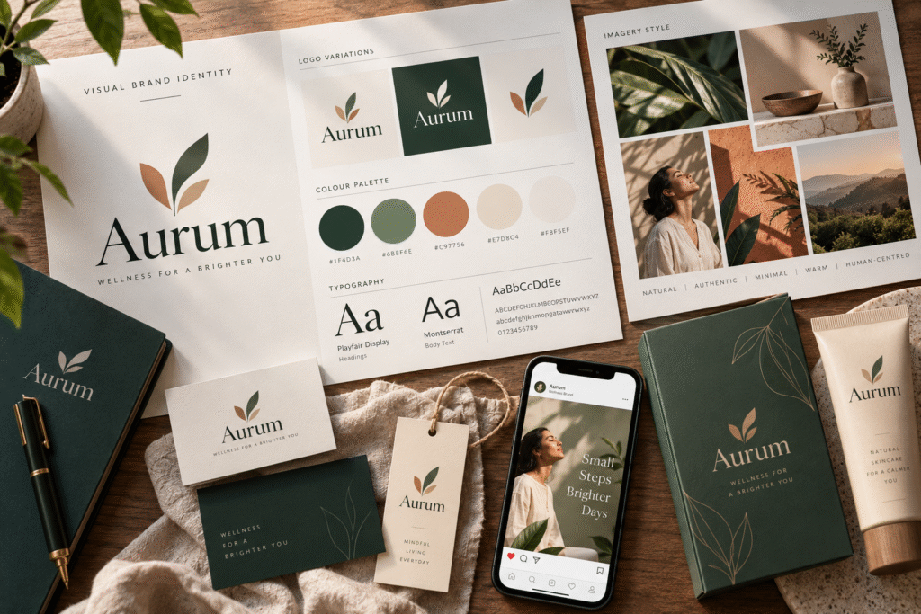
Red means one thing on a Coca-Cola can and something else entirely on a Dhanteras gold-scheme poster. Visual identity doesn’t work off a universal rulebook, it works off decisions, made deliberately, element by element, for a specific brand and a specific audience. “Create a visual brand identity” sounds like one task. It’s actually six smaller ones, each with its own logic.
This is the companion to how to build a brand identity, which covers the full process, strategy through rollout. This post zooms into just the visual layer, the six elements themselves, and how to actually decide each one.
Element 1: the logo
The logo carries more weight than its size suggests, it’s usually the first thing recognised and the most-repeated asset a brand has. The real decision here isn’t “does it look good,” it’s does it still work small, in one colour, and next to five competitors. A mark that only works as a large, full-colour hero image will fail the moment it needs to sit on a favicon or an invoice. See what makes a logo stand out for the specific traits to test for.
Element 2: colour
Colour carries meaning, but that meaning shifts by context, and in India, that shift happens faster than in a single-market brand guide. Red can mean urgency and alert in a Western UI convention, but auspiciousness and celebration in a Diwali or wedding context. Saffron carries specific cultural and political weight that a brand needs to use knowingly, not by accident. A deliberate visual identity doesn’t just pick “a colour that feels right,” it picks one with an understanding of what that colour already means to the specific audience it’s targeting.
A practical approach:
- Primary colour: the one colour people should associate with the brand on sight, India Today’s red is a clean example of this, used consistently enough across decades that the colour itself now signals the brand before the logo does.
- Secondary palette: 2-3 supporting colours for variety without diluting the primary.
- Functional colours: separate colours for things like error states or success messages on digital products, kept distinct from the brand palette so they don’t get confused with it.
Element 3: typography
Typography does two jobs at once: it has to be readable, and it has to carry personality. A rounded, friendly typeface says something different from a sharp, geometric one, even before anyone reads a word of the actual text.
For Indian brands, there’s a third job typography often has to do: working across scripts. A brand operating in Tamil, Hindi or another regional script alongside English needs a typeface pairing that holds the same visual character in both, not a mismatched pairing where the English feels premium and the regional-language version feels like an afterthought. This is a genuinely common gap, and a deliberate pairing here is one of the more overlooked ways a visual identity can either feel considered or feel careless.
A practical rule: one typeface for headings, one for body text, maximum. More than that, and consistency starts slipping the moment someone outside the original design team touches a document.
Element 4: imagery and photography style
This is the element most brands treat as an afterthought, stock photography bought per-project, with no consistent thread. A deliberate visual identity decides this upfront: warm or cool tones, posed or candid, people-focused or product-focused, real customers or professional models. How to use user-generated content covers one specific, high-trust imagery direction many Indian brands are leaning into.
Element 5: iconography and graphic devices
Icons, patterns, textures, these are the supporting cast. They matter less individually than the previous four elements, but they’re often what makes a visual identity feel rich and ownable rather than generic, a recurring pattern on packaging, a distinct icon style across a website. Skipping this entirely is fine for a very early-stage brand, but it’s usually the layer that separates “has a logo” from “has a visual identity.”
Element 6: application, the real test
None of the above means anything until it’s applied to something real: a website, a product label, a social post, a shop sign. This is where problems surface that never show up in a design presentation, a colour that looks different printed than on screen, a logo that doesn’t shrink legibly onto a small label, a typeface that doesn’t render properly in a regional script on certain devices. Budgeting real time for this stage is what separates a visual identity that works from one that only looked good in a pitch deck.
The six elements, at a glance
| Element | Core question to answer | Where it most often goes wrong |
|---|---|---|
| Logo | Does it work small, in one colour, next to competitors? | Only tested at one size, in isolation |
| Colour | What does this colour mean to this specific audience? | Chosen on personal taste, not cultural context |
| Typography | Does it hold its character across every script used? | English gets care, regional scripts get an afterthought |
| Imagery | What style, consistently, not per-project? | Stock photos bought ad hoc, no consistent thread |
| Iconography | Does it add richness without adding clutter? | Either skipped entirely or overused |
| Application | Does it survive contact with the real world? | Only ever seen in a polished presentation deck |
Visual identity is localisation, not just design
A visual identity built for India can’t just translate a global template. Colour meaning, script pairing and cultural symbolism all shift here in ways a generic brand guide won’t catch, and the brands that get this right build it in deliberately rather than discovering the gap after launch.
If you want a visual brand identity built with that context in mind, not six separate decisions made in isolation by whoever happened to be free that week, that’s the actual difference a dedicated design process makes. Akkenna, a holistic branding agency in Coimbatore, builds all six elements together, as one connected system, so nothing gets decided in a vacuum.
A few follow-up questions
Do I need all six elements for a small or early-stage business?
Not at full depth immediately. A logo, a primary colour and one typeface pairing cover the essentials. Iconography and a defined imagery style can be added as the business grows and has more touchpoints to fill.
How many colours should a brand’s palette actually have?
Most working palettes land around 4-6 total: one primary, 2-3 secondary, and a couple of functional or neutral tones. More than that tends to dilute recognition rather than add richness.
Should a visual identity ever change once it’s set?
Yes, deliberately and occasionally, not constantly. See how to develop your brand for when a refresh is actually warranted versus premature.
Ready to build your visual identity properly?
A short brand audit shows which of these six elements are working, and which are quietly working against you. Book a brand audit with the Akkenna team.
