
What Makes a Logo Stand Out?
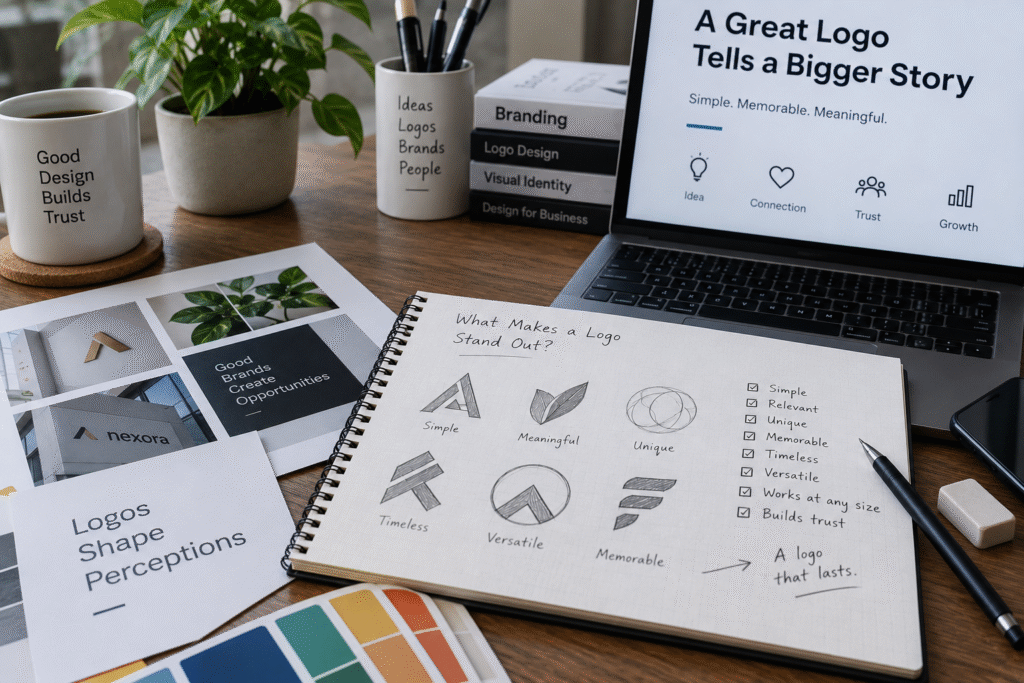
A logo stands out when it’s simple enough to recognise instantly, distinct from competitors in its category, and consistent everywhere it appears. Standout logos rarely win on decoration. They win on being unmistakably theirs, even reduced to a small icon or seen for half a second.
The 6 traits of a logo that stands out
1. Simplicity. The strongest logos reduce to their essentials: a shape, a mark, a few words. Simplicity is also what makes a logo scale, from a billboard down to a favicon, without losing clarity.
2. Distinctiveness. A logo that looks like three others in its category doesn’t stand out, it blends in. Distinctiveness usually comes from one deliberate choice done well: an unexpected shape, a specific colour, an unusual type pairing, rather than trying to be different in every way at once.
3. Relevance. A logo should feel like it belongs to the business behind it, without needing to spell it out literally. A jewellery brand’s logo doesn’t need a drawing of a ring to feel like jewellery. Tone, weight and detail can say that instead.
4. Versatility. A standout logo works in colour and in black and white, at a large size and a tiny one, on a screen and printed on packaging. If a logo only works in one context, it will eventually be used badly in another.
5. Timelessness. Logos built around a passing trend age quickly. The marks that last decades tend to avoid effects and styles tied to a specific year, in favour of choices that don’t look dated later.
6. Consistency in use. Even a well-designed logo stops standing out if it’s applied inconsistently, wrong colours here, a stretched version there. Consistency is a use discipline as much as a design one, which is why brand guidelines matter as much as the logo file itself.
Why some logos fail to stand out
Most weak logos share the same handful of problems:
- Trying to say everything at once. Packing in every service or value the business offers, instead of one clear idea.
- Following a trend too closely. Gradients, specific icon styles or effects that were common in a given year date fast.
- Copying category conventions. A generic shield for security firms, a generic leaf for anything “natural,” blending straight into competitors.
- No system behind it. A logo designed without matching colours, typography and usage rules tends to get applied inconsistently, which erodes whatever distinctiveness it had.
A quick self-test
Ask these of your current logo, or a concept you’re considering:
- Would I recognise it reduced to a small icon, with no text?
- Does it still work in black and white?
- Could I mistake it for a competitor’s mark at a glance?
- Does it still feel right in five years, or is it tied to a current trend?
- Is it being used consistently across everything I’ve published?
If you answer “no” or “not sure” to more than one of these, the logo likely isn’t doing its job yet.
A standout logo is part of a system, not a stroke of luck
A memorable logo rarely comes from one clever idea. It comes from testing a concept against competitors, checking it at every size and use case, and building the rules that keep it consistent for years. If your current logo isn’t earning a second look, it may be time to have your logo designed properly rather than tweaked again. Akkenna, a holistic branding agency in Coimbatore, designs logos as part of a full identity system, so distinctiveness holds up everywhere the brand shows up.
Frequently asked questions
Does a logo need to be colourful to stand out?
No. Some of the most recognisable logos work in a single colour or in black and white first, then colour is added as one more distinguishing choice, not the main one.
Should a logo include an icon, or just the company name?
Either can stand out. A wordmark relies on strong typography and spacing, while an icon relies on shape and simplicity. The right choice depends on the business and how the name reads.
How do I know if my logo is too similar to a competitor’s?
Compare it directly, at small size and in black and white, against your closest competitors’ logos. If someone could mix them up at a glance, it’s too close.
Can a logo stand out without a full rebrand?
Sometimes. A refinement to spacing, colour or type can sharpen a weak logo without changing the whole identity. A full rebrand is only needed when the underlying concept itself is the problem.
Not sure if your logo is working?
A short brand audit shows whether your logo and identity are actually standing out, or blending in. Book a brand audit with the Akkenna team.
