How to Create a Visual Brand Identity: A Step-by-Step Guide
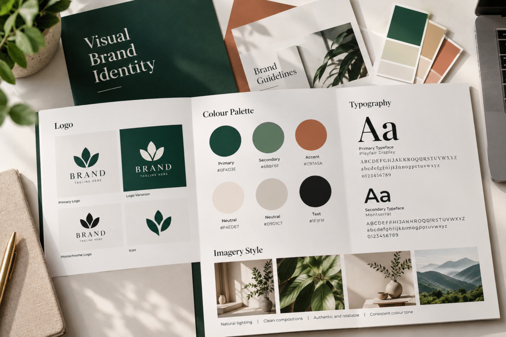
A visual brand identity is what people see before they read a single word: the logo on a sign, the colours on a website, the look of a social post, the feel of a package. When it’s done well, a business becomes recognisable and credible quickly. When it’s done badly, even a good business can look generic or inconsistent.
This guide explains how to create a visual brand identity, from the thinking that should come first to the elements you need and the way to apply them. It’s written for founders and marketing teams rather than designers.
What Is a Visual Brand Identity?
A visual brand identity is the system of visual elements that represents a brand and makes it recognisable. It usually includes:
- Logo and logo variations
- Colour palette
- Typography
- Imagery style
- Iconography and graphic elements
- Layout principles
It’s not just a logo. A logo is one component. The identity is the whole system, and its job is to express the brand’s strategy visually and consistently. Our post [Brand Strategy vs Brand Identity: What’s the Difference?] explains how the two relate.
Why a Visual Identity Matters
- Recognition. Consistent visuals help people remember you.
- Credibility. A coherent look signals care and professionalism.
- Differentiation. Visual choices can separate you from competitors who say similar things.
- Efficiency. A defined system makes it faster to produce new material.
- Consistency. It keeps the brand coherent across the website, social media, print, and packaging.
Step 1: Start With Strategy, Not Design
The most common mistake is opening a design tool before the brand is defined. A visual identity should express decisions already made about:
- Who the brand serves
- What it stands for
- How it’s positioned against competitors
- What personality it should have
- How it should be perceived
If those answers are unclear, the visuals tend to default to taste or trends. Working through brand strategy first gives the identity something to be accountable to. A useful test is to turn personality into visual direction: if the brand is calm and premium, restrained colour and generous spacing make sense; if it’s energetic and youthful, bolder colour and movement may fit.
Step 2: Research Your Market and Competitors
Collect what your competitors and adjacent brands look like. You’re not looking to copy, but to see:
- Which colours and styles dominate your category
- Where brands look alike, and where there’s room to be distinct
- What your audience is used to seeing and what signals quality to them
Some conventions are worth following because they help customers understand the category. Others are worth breaking to stand out. The goal is to be recognisable and different, not just different.
Step 3: Define a Visual Direction
Before designing anything, write a short brief and collect references:
- Three to five words describing the intended look and feel
- A moodboard of imagery, textures, typography, and colour references
- A list of things the identity should not feel like
This gives everyone involved, including stakeholders who will review the work, a shared language to react to. It reduces subjective feedback later.
Step 4: Design the Logo System
The logo is often the centrepiece, so it deserves careful thought. A good logo is:
- Simple, so it’s recognisable at a glance
- Distinctive, so it doesn’t resemble competitors
- Versatile, so it works small and large, in colour and one-colour, on light and dark backgrounds
- Appropriate, so it suits the audience and the category
Most businesses need a set of variations rather than a single file: a primary logo, a stacked or horizontal alternative, an icon or monogram for small spaces such as favicons and social avatars, and one-colour versions. Test the logo in real contexts, including the website header, mobile navigation, a social profile image, and packaging, before approving it. Professional logo design should always include this kind of range testing.
Step 5: Choose a Colour Palette
Colour carries emotion and also does practical work in interfaces and print. Build a palette with clear roles:
- Primary colours that carry the brand
- Secondary colours that add range
- Neutrals for text, backgrounds, and borders
- Functional colours for success, warning, and error states if you have digital products
Think about meaning, but also usability. Check contrast between text and background so content is readable, using the minimum standards in the W3C Web Content Accessibility Guidelines. Record each colour in the formats you’ll need: HEX and RGB for screens, CMYK for print, and Pantone where spot colours are used.
Step 6: Select Typography
Typefaces shape personality and readability. Choose:
- A headline typeface with character
- A body typeface that’s comfortable to read at small sizes
- Weights and sizes for a simple hierarchy
Keep the number of typefaces small, usually one or two. Test them in real settings, such as long paragraphs, buttons, navigation, and mobile screens, not just in a logo lockup. Check licensing, too, so you know whether fonts are cleared for web and app use. For emails and documents where brand fonts may not load, specify fallbacks.
Step 7: Define Imagery and Graphic Language
Imagery tells people what the brand feels like. Decide:
- Photography style: subject matter, lighting, composition, colour treatment, and what to avoid
- Illustration or motion style, if the brand uses them
- Icons: line weight, corner style, and level of detail
- Graphic elements: patterns, shapes, lines, or textures that recur across materials
These choices are where many brands drift, since stock imagery and mismatched icons creep in over time. Documenting examples of right and wrong helps. Consistent graphic design assets across social posts, decks, and print turn these rules into something people can see.
Step 8: Set Layout and Composition Principles
Describe how elements come together: grids, spacing, alignment, and hierarchy. Even simple principles, such as generous white space, consistent margins, or a defined way of placing the logo, help materials made by different people feel related.
Step 9: Apply the Identity to Real Materials
An identity is only proven when it’s applied. Test it on the touchpoints you actually use:
- Business cards, letterhead, and presentation templates
- Social media posts and profile assets
- Email signatures and newsletters
- Brochures and sales material
- Signage and merchandise
- Packaging, if you sell physical products. Good packaging design tests colour and typography decisions in the real world
Fix problems now. A logo that vanishes on a dark background or a colour that prints differently is far cheaper to correct before launch.
Step 10: Extend It to the Website and Digital Products
For many businesses the website is the main place the identity lives. It should translate visual decisions into components such as buttons, forms, cards, navigation, and responsive layouts, not simply place the logo in the header. Planning UI/UX design around the identity keeps structure and style aligned, and building it through web design and development helps preserve the design system after launch. We explore this transition in [From Brand Identity to Website: How a Brand Becomes a Digital Experience].
Step 11: Document the Identity in Brand Guidelines
Once the system is settled, record it so it can be applied consistently by others. Good brand guidelines cover logo rules, colour, typography, imagery, voice, applications, and ownership. See [How to Design Brand Guidelines: A Practical Guide] for how to structure them.
Common Mistakes When Creating a Visual Identity
- Starting with the logo. Without strategy, the design lacks direction.
- Following trends. Styles date quickly. Timeless choices tied to brand personality last longer.
- Copying competitors. It erodes differentiation.
- Using too many colours or fonts. Restraint usually looks more confident.
- Ignoring digital use. Test on screens, small sizes, and mobile.
- Skipping accessibility. Contrast and readability affect real users.
- Designing for approval, not recognition. The aim is memorability, not that everyone in the room likes it equally.
- Not documenting it. Without guidelines, consistency slips as soon as new people use the brand.
- Treating it as finished. Review the identity as the business grows.
A Quick Checklist
- Strategy and positioning are defined
- Visual direction is agreed
- Logo has variations and works at small sizes
- Colour palette has roles and accessible pairings
- Typography is tested in real interfaces
- Imagery and graphic style are described with examples
- Identity is applied to real materials
- Website and digital use are planned
- Guidelines are documented
How Akkenna Can Help
A visual identity works best when it’s connected to strategy on one side and to the website and content on the other. Akkenna works across strategy, design, technology, and growth, so identity can be built as part of one process. If your brand looks different depending on where people meet it, talk to Akkenna about a brand identity review.
FAQ
What is a visual brand identity? It’s the system of visual elements that represents a brand, including logo, colours, typography, imagery, graphic elements, and layout principles, designed to make the brand recognisable and consistent.
What are the elements of a visual brand identity? Common elements are a logo and its variations, a colour palette, typography, imagery style, iconography, graphic elements, and layout principles. Many identities also define voice and motion.
How do you create a visual brand identity? Start with brand strategy, research competitors, define a visual direction, then design the logo, colours, typography, and imagery. Test them on real materials and document the system in brand guidelines.
What is the difference between a logo and a visual identity? A logo is one element. A visual identity is the whole system of visual elements that work together to represent the brand.
How long does it take to create a visual brand identity? It depends on scope, research, and the number of applications. A focused identity takes less time than one that includes complex packaging, multiple products, or a full digital system.
Do I need brand strategy before a visual identity? It’s strongly recommended. Strategy gives the visual choices a purpose, so the identity expresses positioning rather than personal taste.
How many colours and fonts should a brand use? There’s no fixed number, but restraint helps. Many brands use a small palette with clear roles and one or two typefaces.
Can I update my visual identity without a full rebrand? Yes. If positioning is still sound, a refresh can update logo, colours, typography, or imagery without changing the strategy.
